About This Map
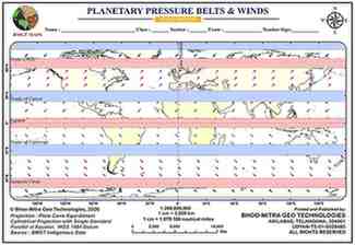
A blank planetary-scale map showing Earth's seven pressure belts and the four wind systems they drive, color-coded so each wind is visually paired with the belt that creates it — black for the Polar Easterlies, magenta for the Prevailing Westerlies, red for the NE Trade Winds, and blue for the SE Trade Winds — all mirrored symmetrically across the Equator, with blue bands marking high pressure and pink/red bands marking low pressure.
The seven pressure belts (pole to pole)
- Polar High (North) - blue band, at the North Pole
- Subpolar Low - pink/red band at the Arctic Circle (~66.5°N)
- Subtropical High - blue band at the Tropic of Cancer (~23.5°N)
- Equatorial Low (doldrums) - pink/red band at the Equator (0°)
- Subtropical High - blue band at the Tropic of Capricorn (~23.5°S)
- Subpolar Low - pink/red band at the Antarctic Circle (~66.5°S)
- Polar High (South) - blue band at the South Pole
The four wind systems (color-coded on the map)
- Black arrows - Polar Easterlies: blow from the Polar High toward the Subpolar Low, poleward of the Arctic/Antarctic Circles in both hemispheres
- Magenta arrows - Prevailing Westerlies: blow from the Subtropical High toward the Subpolar Low, roughly 30°-60° in both hemispheres (historically the 'Roaring Forties' sailing route)
- Red arrows - NE Trade Winds: blow from the Subtropical High toward the Equatorial Low, Northern Hemisphere tropics (0°-30°N)
- Blue arrows - SE Trade Winds: blow from the Subtropical High toward the Equatorial Low, Southern Hemisphere tropics (0°-30°S)
Why the arrows tilt diagonally
- Air never moves in a straight line from high to low pressure - the Coriolis effect deflects it right in the Northern Hemisphere and left in the Southern Hemisphere, which is why the Trade Winds arrive as 'NE' and 'SE' rather than due north/south
The underlying circulation cells
- Hadley Cell (0°-30°) - warm air rises at the Equator and sinks at 30°N/S, producing the Trade Winds at the surface
- Ferrel Cell (30°-60°) - produces the Prevailing Westerlies
- Polar Cell (60°-90°) - produces the Polar Easterlies
- The bands on the map mark exactly where these three cells meet the surface
Why the pattern shifts seasonally
- The whole belt system follows the 'thermal equator' - the latitude receiving the most direct sunlight - migrating between the Tropics of Cancer and Capricorn through the year
- This seasonal shift drives the Indian monsoon: the belts move north in the Northern Hemisphere summer, pulling the SE Trade Winds across the Equator where they get deflected into the SW Monsoon
Tips And Tricks
- Learn the seven pressure belts pole-to-pole before the winds — each wind system is just air flowing from a high-pressure belt to the nearest low-pressure belt, deflected by the Coriolis effect.
- The Trade Winds are the only system on this map that blows toward the equator from both hemispheres at once — where they meet is the Intertropical Convergence Zone (the doldrums).
- Winds are always named for the direction they blow FROM, not toward — a Westerly blows from the west toward the east, and the NE Trade Wind blows from the northeast toward the southwest. Reverse that logic and every arrow on the map will look backwards.
- This belt pattern isn't fixed in place — it migrates roughly 5°-10° following the sun through the year, which is exactly why the Indian subcontinent gets a full wind reversal (the monsoon) instead of a steady Trade Wind pattern like most of the tropics.
- Use a simple High-Low-High-Low-High-Low-High checklist from pole to pole: Polar High, Subpolar Low, Subtropical High, Equatorial Low — then the same three belts mirrored back up through the Southern Hemisphere.
Comments & Issue Reporting
Sign in to leave a comment or report an issue with this map.
No comments yet — be the first to share your thoughts.